Sunday, August 8, 2010

Archifest 2009-Coltswald Close

An interesting house which we visited towards the end of the tour was the Coltswald Close house designed by Annex A.

The architect Mark Wee, was present at the venue itself to explain the work too.

It was a house that was occupied for many years by a family.

They had wanted to refurbish the house as they had a growing family.


The design brief was to design a modern home, but still retaining its old school charm.

The final product was a house that fused the old with the new, in a very unique manner.

I liked it for its old school flavour and its many memories of the past that was retained in the architecture and details.

Wednesday, December 16, 2009

Archifest 2009-RT&Q

Rene Tan of RT&Q showed us to his house as part of the Archifest 2009 Safari tour.

The house has been published in numerous Singapore Architecture magazines.

Nestled in a delightful suburb of Watten Estate, the terrace house is unassuming in its external treatment.

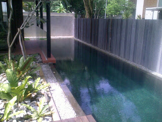
Rene managed to fit a long swimming pool into the plot of land.

This pool effectively serves to give the impression of the terrace as separated from its neighbbour.

The pool, while possibly too narrow to swim in, acts as an effective buffer from the neighbour.

It also works well as a water feature at the living room!
The following pictures show the pool as well as the toilet that is cleverly hidden behind.

The wc is elevated on a marble slab. Water surrounds the wc.

There are definitely many moments of interest in the house. Here are some of them that caught my eye -  enjoy...


Monday, December 14, 2009

Archifest 2009-Lien Collectives: Terre Clubhouse

The clubhouse was actually the original house situated on the plot. Terre was engaged to restore and remodel the house to a clubhouse that is to be shared for all tenants of the 5 other houses once it is leased to their respective tenants.


The house retains its heritage by keeping certain key elements.
For instance, from the facade, the timber windows and the tiled roof remains intact and well-restored.


At the front entrance, the original chinese door frame was kept with an additional timber door built on the opening side.


A fern and pebble garden greets us upon entering, with a grand memorial plaque in the centre. It mentions the history of the house and their owners. A flight of stairs leads us to the 2nd storey upon entering at the front entrance.


The overall character of the house is very reminiscent of its chinese heritage. With the new elements, the architect seem to have made careful choices too. The selections all relate very well this heritage theme. Check out the long bath!

The design of the clubhouse was certainly a done in good measure and served as a focal point for the houses on the site. It was a reminder of its past and designed in a way that totally blended well with its green surrounds.

There were many gathering spaces, large dining areas, sitting areas and even a basement bar counter facing the greenery beyond.

Wednesday, December 9, 2009

Archifest 2009 - Lien Collectives: Tierra


The next house was by landscape architecture firm, Tierra.  Of course, Tierra is known for their landscaping work both for high end residential as well as for nice houses in the Singapore architecture scene.

Designed by the principal, Franklin, the house sits on top of the slope. It cuts an interesting silouette with its composition of a cluster of pitched roof boxes.

Nestled amidst the tall leafy trees, the houses made for a very subtle statement. We liked the way it was bunched together to give it an almost organic composition, quite in reflection to its surrounds.

I liked the interior as much as the exterior, with its timber framed windows that effectively frame our views to the outside.


 Most of the spaces seem to have a window placed strategically. It was effective especially with all the white walls - the windows drew one immediately to it. The windows were mostly large enough for the greenery and sunlight to enter and illuminate the room.


The greenery was almost visible everywherre from within. Here's some views from the staircase landing catching more glimpses of the leaves outdoors...


Monday, December 7, 2009

Archifest 2009-Lien Collectives: Ministry of Design


In one of the bigger plots at the site, Ministry of Design (MOD) engaged the site in a very understated fashion, quite unlike the usual style of the young Singaporean firm. The design of the house was intended to relate to the elongated context of the site. It was conceived to be a continous space. It's most obvious when seen from the roof top view. Here's a computer-generated image that best shows this view...


The house is flanked on the side with a narrow pool that takes the shape of the house. At the elevation view, one can see a few layers - from the water edge, the timber walkway to the walls of the house and the flat roof that followed the shape of the house.


The palette for the interior was very much clean and simple - white washed walls with white marble and mosaics for the bathroom. The floor is expressed as a seemless expression by way of timber strips that line the spaces from entry through to the corridors and to the individual bedrooms.


Friday, December 4, 2009

Archifest 2009-Lien Collectives: K2LD

K2LD was engaged to conceptualise the entire site, and also to work on the design for 1 of the plots. As far as Singapore architecture goes, this firm has garnered recognition for their excellent design projects, ranging from houses to apartments.


In the design of the house, the main statement was surely the huge oval shaped space in the centre of the pool.

A bridge leads to this The space was a shaped with glass panels and vertical timber members. Everyone seemed to wonder what the space was for...

I guess it was enough that it made an impact. While the space seem to be submerged in the pool, a view from the other elevations reveals that it really was standing on steel stilts.

I must say the overall language seemed almost 'ordinary' in comparison to the other show cases on the site. I'm sure the students and young designers in the crowd of visitors may agree with me here.
Nonetheless, there were many nice details that were fashioned in timber - part of the recurring theme for the house. From the front door to the staircase and the walkways and corridors, the materials and combination of them, made for interesting study in detailing.

For instance, at the front door, we see large panels clear fixed glass in exposed steel mullions. The door is in timber and gives a sense of contrast. The walls are a combination of textured plaster with fair-faced concrete.


As you walk into the house, from the front entrance to the main spaces of the house a staircase leads you to the living spaces and bedrooms. A large skylight greets us as we emerge from the stairs. The articulation of timber ceiling and skylight certainly lend warmth into the space.


The exceptionl detailing also continues with the doors for storerooms and bedrooms...